Skip To Main Content

Contrast

Make it easier for users to see and hear content by separating foreground from background and using colors that contrast well against each other. Due to the variety of color deficiencies, it is recommended you test your colors and images with the color blind simulator. You also may test color combinations to ensure good contrast.

Example of white text on maroon background

Do

Do use colors that contrast well against each other.

Crossed out example of white text on yellow background

Don't

Don't use complementary colors, bright colors, or low contrasting colors against each other.

Using Color to Convey Meaning

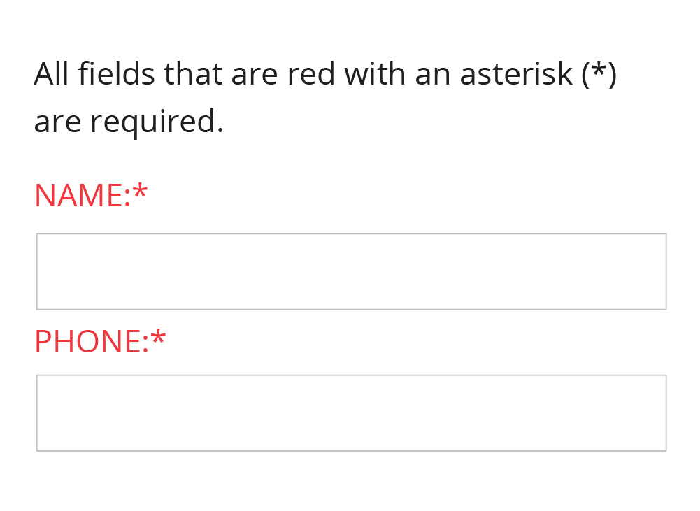
Example of a form using color and text to denote required fields

Do

Do use color with another differentiation to distinguish visual elements.

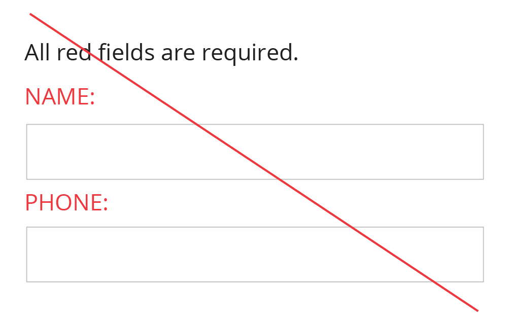
Crossed out example of a form using only color to denote required fields

Don't

Don't use color as the sole method of distinguishing visual elements.

Color in Links

Color alone is not to be used to distinguish links from surrounding text unless the luminance contrast between the link and the surrounding text is at least 3:1 and an additional differentiation (e.g., it becomes underlined) is provided when the link is hovered over or receives focus.
Example of black text with a blue, underlined link

Do

Do use a high contrast color and underline to distinguish links in text.

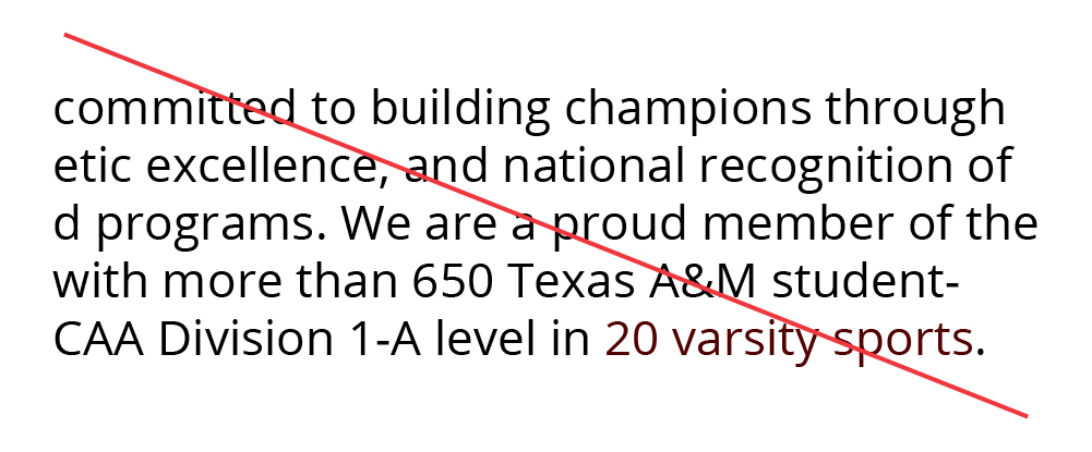
Crossed out example of black text with a maroon link

Don't

Don't use maroon alone to determine a link (not sufficient contrast between black and maroon text).