Email Signatures
No logos or graphics should be used in university email signatures.
DO

Do use minimal formatting.
Do use caution when selecting colors.
Example:
Don't
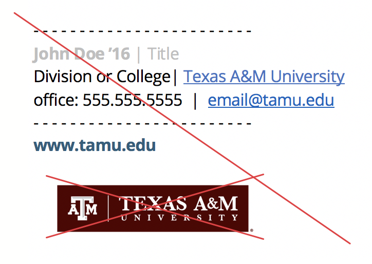
Don't use JPGs, PNGs, or any other image types.
Don't use low-contrast colors.
Example:
Promotional Emails
Do

Do use the TAM Logo Box in email image headers.
Example:
Don't

Don't use the White TAM Logo on backgrounds that aren't maroon.
Example:
Do
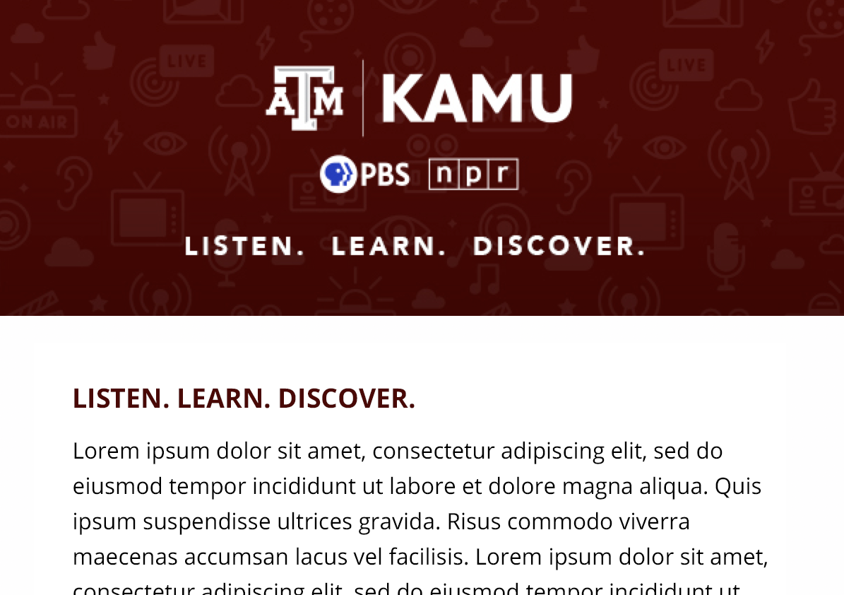
Do be considerate of persons with disabilities and use header images for decoration rather than communication.
Note: If text must be used in the header image, also include it in the email body as a text heading.
Example:
Don't
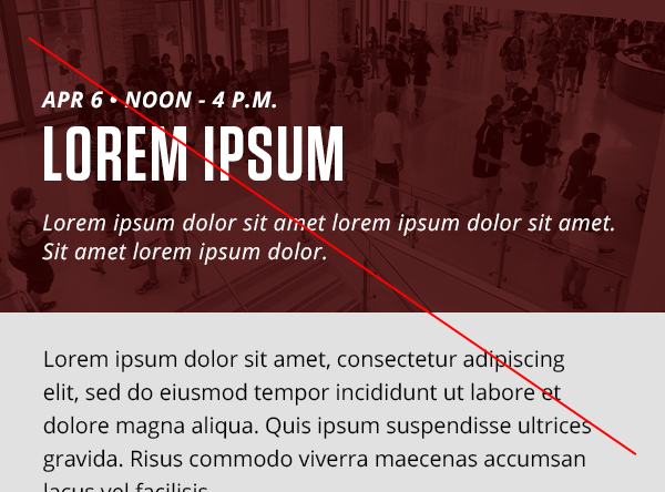
Don't place text (other than a logo) in header images whenever possible.
Example:
If your division, college or department is branching out onto social media for the first time, or if you are new to the university communications environment and are looking to enhance your unit’s social media presence, we’re here to help.