Skip To Main Content

When using any Texas A&M logo, be sure to scale all marks proportionally, and use the electronic logo files as provided in the Logo Downloads section with registered trademark symbol.

Note the incorrect use cases below:

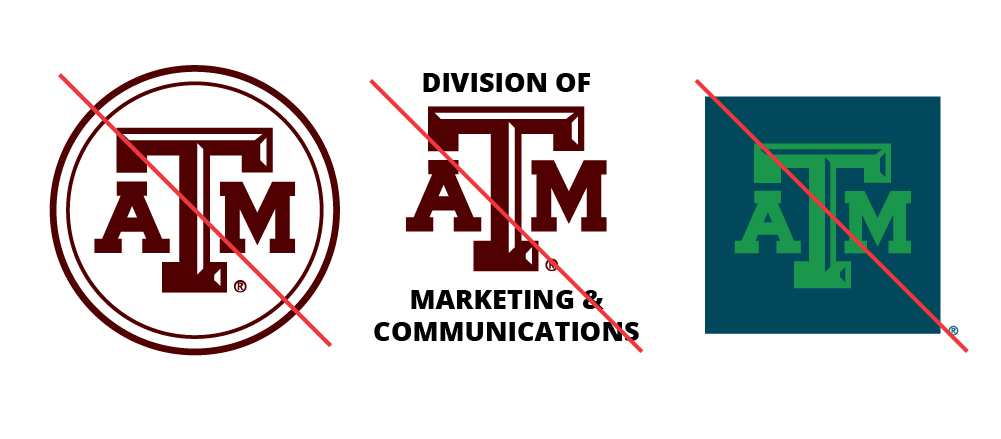
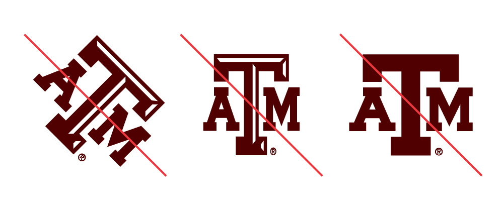
Examples of distorted (rotated, squeezed, without bevel) A&M logos

Don't

Don't distort, modify or remove elements from the official university logos provided in the Logo Downloads section.

Examples of custom A&M logos

Don't

Don't create your own logo, use incorrect colors or add elements to the official university logos.

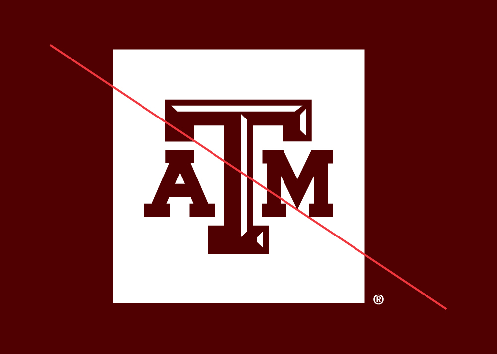
A maroon A&M logo with a white box on a maroon background

Don't

Don't reverse the TAM Logo Box as white with a maroon TAM.

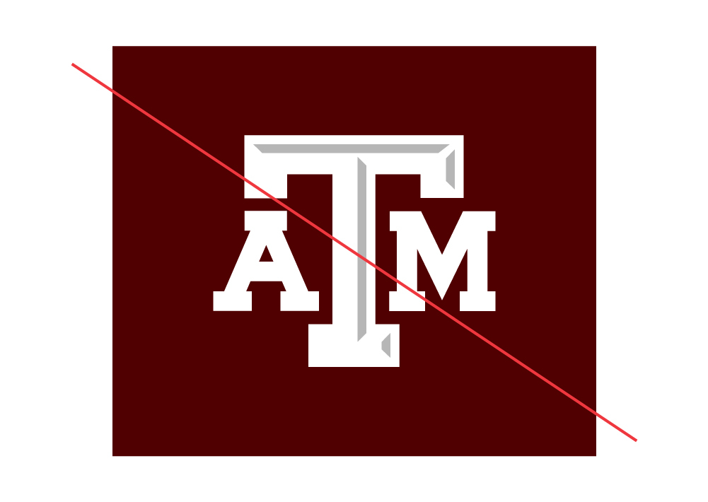
Rectangular A&M logo

Don't

Don't recreate the TAM Logo Box with a different size box.

Clear Space

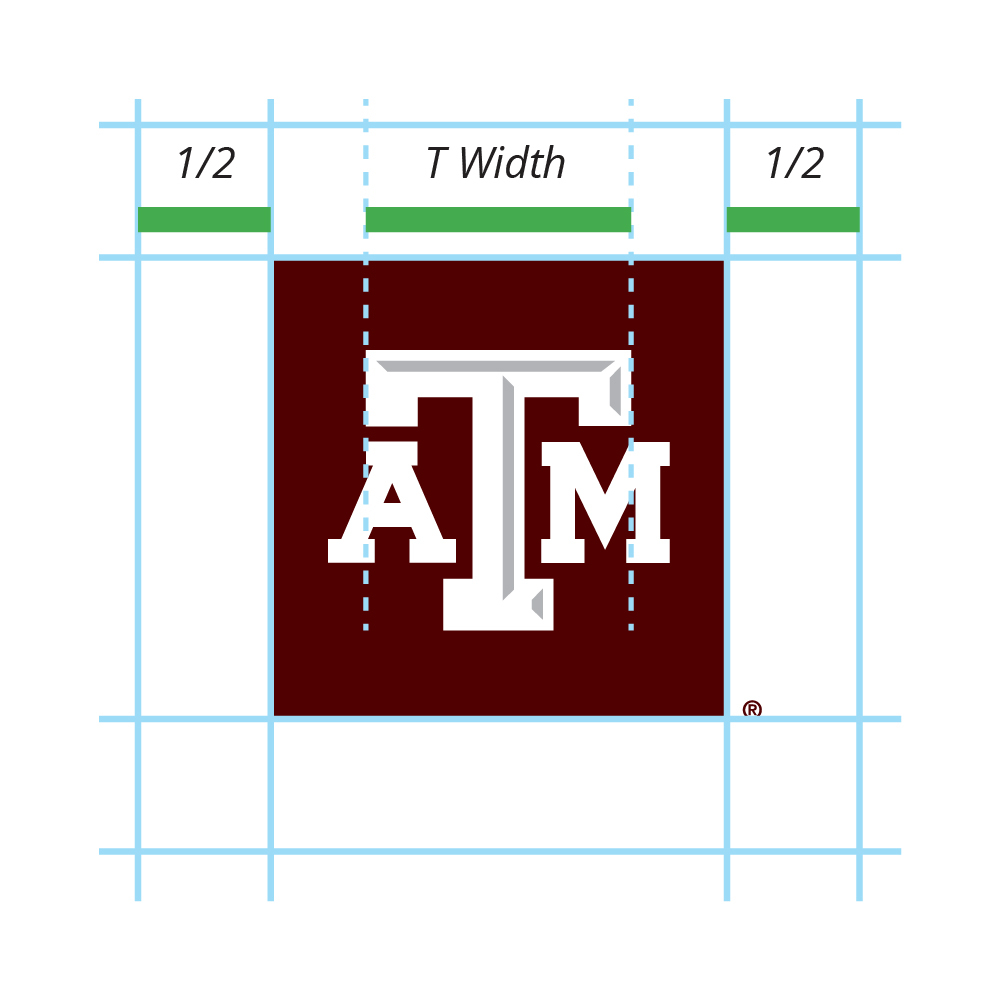
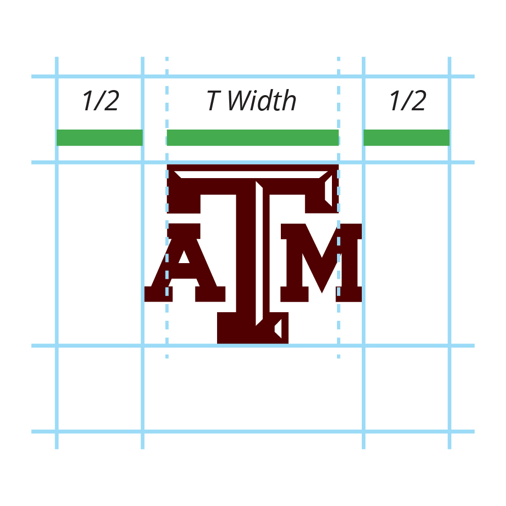
Clear space is necessary to provide breathing room around the unit identity. Leave a clear space around the top, bottom, left and right of the logo that is half of the “T width” in the TAM.

Example showing margins equal to half the width of the T in the A&M logo

Box TAM Example

Using the span of the "T width", build in padding out from the box, not including the registration mark.

Example showing margins equal to half the width of the T in the A&M logo

Block TAM Example

Using the span of the "T width", build in padding out from the edges of the logo.

Minimum Size

To ensure legibility, logos and unit identities must not be reduced beyond the following defined minimum size:

  • Logos and unit identities should not be printed smaller than .5 inches tall.
  • When displayed on screen, they should never appear smaller than 30 pixels tall.
  • When embroidered, they should never be sewn smaller than 1.125 inches tall.
Multiple Unit Identities

If you need to identify more than one university entity equally on a communication, use the following guidelines:

Example showing a single A&M logo completely separate from the multiple names of unit identities

Do

Do use one logo, preferably the TAM logo box, and list multiple units as part of the content or within the design.

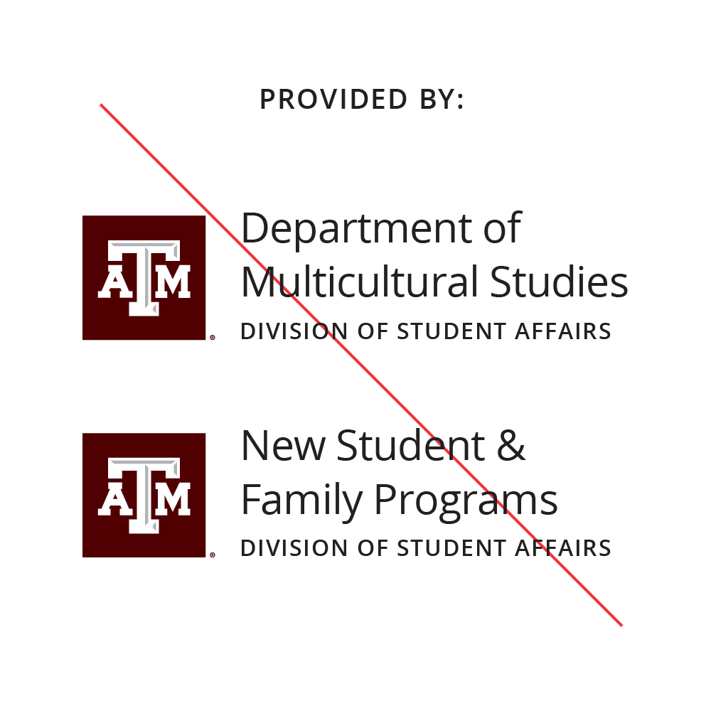
Example showing a repeated A&M logo next to each unit identity

Don't

Don't use more than one unit identity in the same design space (ie the same page of a print communication, t-shirt or website page)